BCycle Mobile App Rewrite
-
This app refactor project involved rewriting the entire code base of the BCycle Mobile app. The challenge was providing a fully-functional user experience with enhanced features, a modernized user interface, and forward-thinking design that would support future iterations, all on a short timeline.
Throughout the project, I served as project manager, business analyst, and UI/UX designer. The project demanded close coordination across technical and business teams while balancing user needs with organizational priorities. Stepping into these various roles, I quickly became a go-to for any and everything related to the BCycle app.
I coordinated cross-functional collaboration, aligned stakeholders around business objectives, managed timelines and priorities, and established feedback loops to guide iterative improvements. Working closely with the UI/UX Design Manager from Trek Bicycle, I translated user preferences and business requirements into intuitive interface designs, ensuring the redesigned app supported both immediate user needs and long-term product strategy.
The project successfully delivered a fully refactored mobile application with an updated user experience and a scalable technical foundation for continued development. Leading this initiative strengthened my ability to manage complex, cross-functional projects while integrating product strategy, business analysis, and user-centered design to deliver a cohesive digital experience.
-
Rebuilding the BCycle mobile app on a tight timeline required the team to establish clear product requirements, strategically prioritize features, and maintain alignment across technical teams and senior leadership despite evolving priorities.
I led product discovery by auditing the existing application, mapping current functionality to future-state user flows. I evaluated each feature to determine whether it should be added, omitted, or changed, helping to define a realistic minimum viable product while identifying enhancements for future releases.
To support decision-making, I documented product requirements, design decisions, dependencies, and potential risks throughout the project. I upheld transparent communication policies both within and outside of the team, fostering a culture where all felt free to share ideas and ask questions.
I provided project updates to senior leadership weekly. I made these updates honest, sometimes telling leadership things they didn’t want to hear, in order to ensure informed decision making.
This planning process established a shared understanding of project scope, reduced ambiguity throughout development, and enabled the team to make informed decisions as priorities evolved. Comprehensive documentation and consistent stakeholder communication helped maintain alignment across teams, supporting an on-time delivery in the now while creating a clear roadmap for the app in the future.
-
This project involved numerous technical and operational dependencies that made sequencing work especially complex. In addition to coordinating engineering efforts, the project had to accommodate contractual commitments and feature rollouts supporting bike share operators across the United States.
I analyzed cross-system dependencies to develop a phased implementation strategy, breaking large initiatives into manageable releases, allowing engineers to work in parallel and focus on specialized areas of the application. As development progressed, I continuously reassessed priorities, uncovering new technical dependencies and adjusting the roadmap to account for unexpected rework and shifting constraints. Beyond the engineering team, I worked closely with bike share operators to understand contractual requirements and incorporated market-specific features into the release plan without losing sight of overall project goals.
By proactively managing technical and operational dependencies, I kept development moving despite evolving requirements and unforeseen challenges. The phased release strategy improved team efficiency, supported more predictable delivery, and balanced the needs of engineering, business stakeholders, and external partners throughout the transformation of the main interface of the BCycle business.
-
Reimagining the BCycle mobile app required balancing user needs, business goals, and technical constraints. As project manager, business analyst, and designer on this project, I brought a wealth of design options to the table to help the final decision makers to make decisions informed from multiple perspectives.
I analyzed current product usage, tested prototypes, conducted user experience research, and created informed mockups reflecting 3-5 ways of approaching a particular feature. I knew the ins and outs of the entire app in terms of both functionality and design. Equipped with detailed mockups, I presented evidence-based recommendations, considering usability, business objectives, and engineering complexity throughout.
During collaborative design reviews, I worked closely with the product team to refine proposed solutions, hashing out each detail, validating technical feasibility of the proposed options, and iterating toward the strongest solution.
This structured, research-driven approach enabled the team to make product decisions with greater confidence and transparency. By presenting multiple well-supported solutions rather than a single recommendation, I facilitated productive cross-functional discussions and ensured that final designs reflected user needs, business priorities, and technical realities alike.
-
This rewrite project presented an opportunity to modernize the user experience and reduce friction for new riders. The redesign needed to simplify onboarding, improve usability, and encourage more customers to use the app as their primary way of accessing the bike share system.
I analyzed existing user flows and product usage to identify opportunities to simplify the experience, helping the team determine which features to retain, redesign, or remove. Using Figma, I created a scalable design system with reusable components that accelerated iteration and ensured consistency across the application. I collaborated closely with engineers to streamline the onboarding experience, reducing the time required to create an account and check out a bike to under one minute. Throughout the design process, I conducted usability testing with both existing BCycle users and first-time riders, using participant feedback to refine navigation, screen flows, and in-app guidance before final release.
The redesigned app delivered a faster, more intuitive experience that lowered barriers to adoption for new and returning riders. Following the redesign, app adoption increased from 83% to 96%, demonstrating the impact of a user-centered design process on consumer behavior. By pairing research, iterative design, and close engineering collaboration, I helped create an experience that made bike share more accessible and approachable for a broader audience. Clear and concise app walkthroughs show the user how the bike share works and with signup taking less than a minute, checking out a bike from a BCycle station has never been easier.
*The designs and ideas for this project are property of BCycle and therefore only publicly-released designs are shown here. See below for a few examples of the designs before and after the rewrite.
-
Launching the redesigned app was only the first step. To ensure future releases continued to meet the needs of riders and bike share operators, the team needed a structured process for gathering, analyzing, and prioritizing product feedback across multiple markets.
To support this, I established feedback channels that captured insights from both bike share operators and end users through interviews, polls, virtual suggestion boxes, and app store reviews. I combed through all of this feedback to glean what improvements could still be made to support the operator and end user experience. I translated these findings into actionable product requirements by creating detailed work items and collaborating with the development team to prioritize enhancements for future releases.
This ongoing discovery process created a continuous feedback loop that provides critical insight to current usability highlights and pain points, informing the product roadmap long beyond the initial launch.
*Due to the fact that this is a private project designed for BCycle, these future development plans are not available for public distribution.
Before & After
A closer look at design decisions that transformed the BCycle app, making for a more modern and user-friendly interface and minimizing the number of steps it takes to utilize bike share.
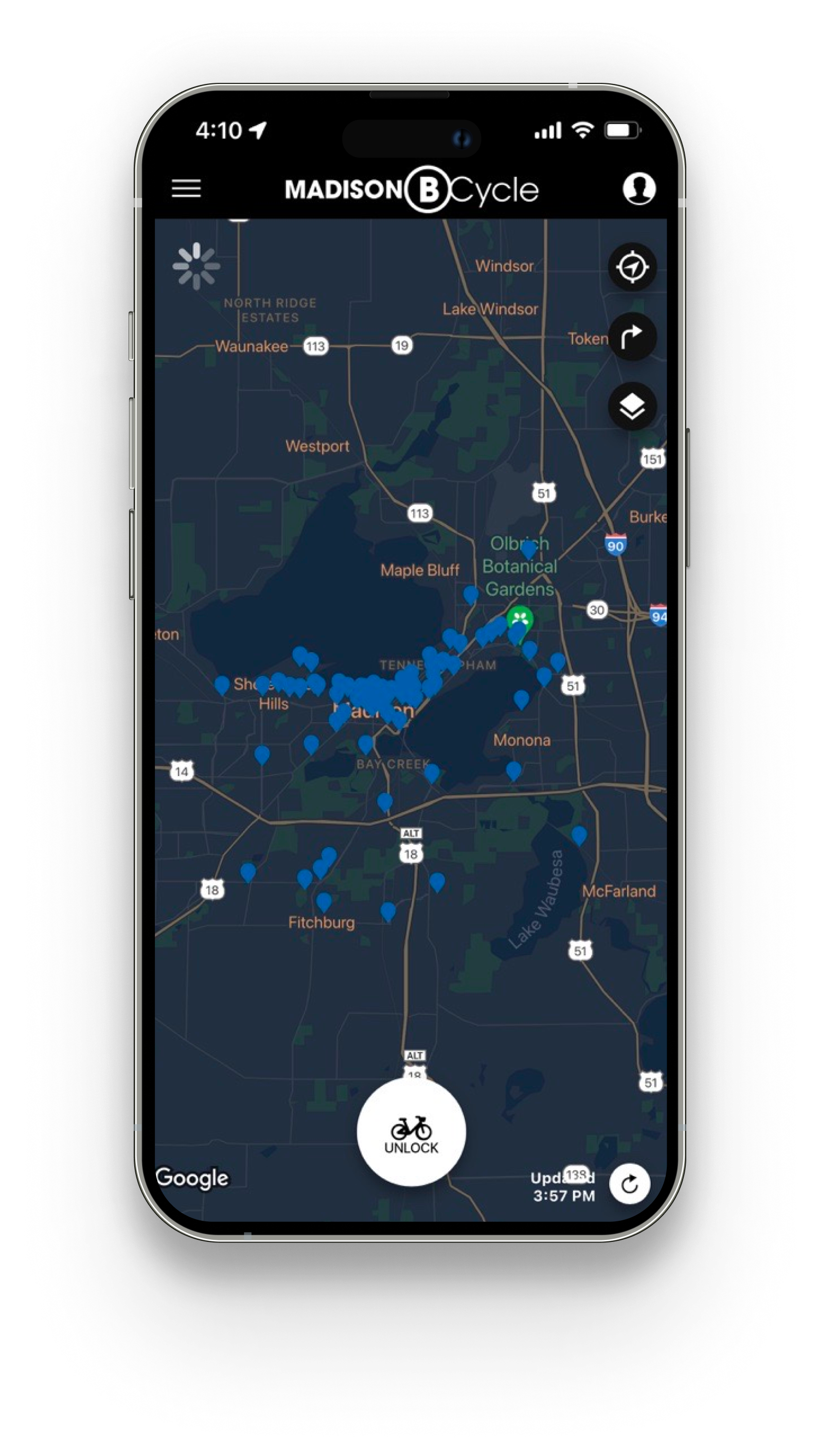
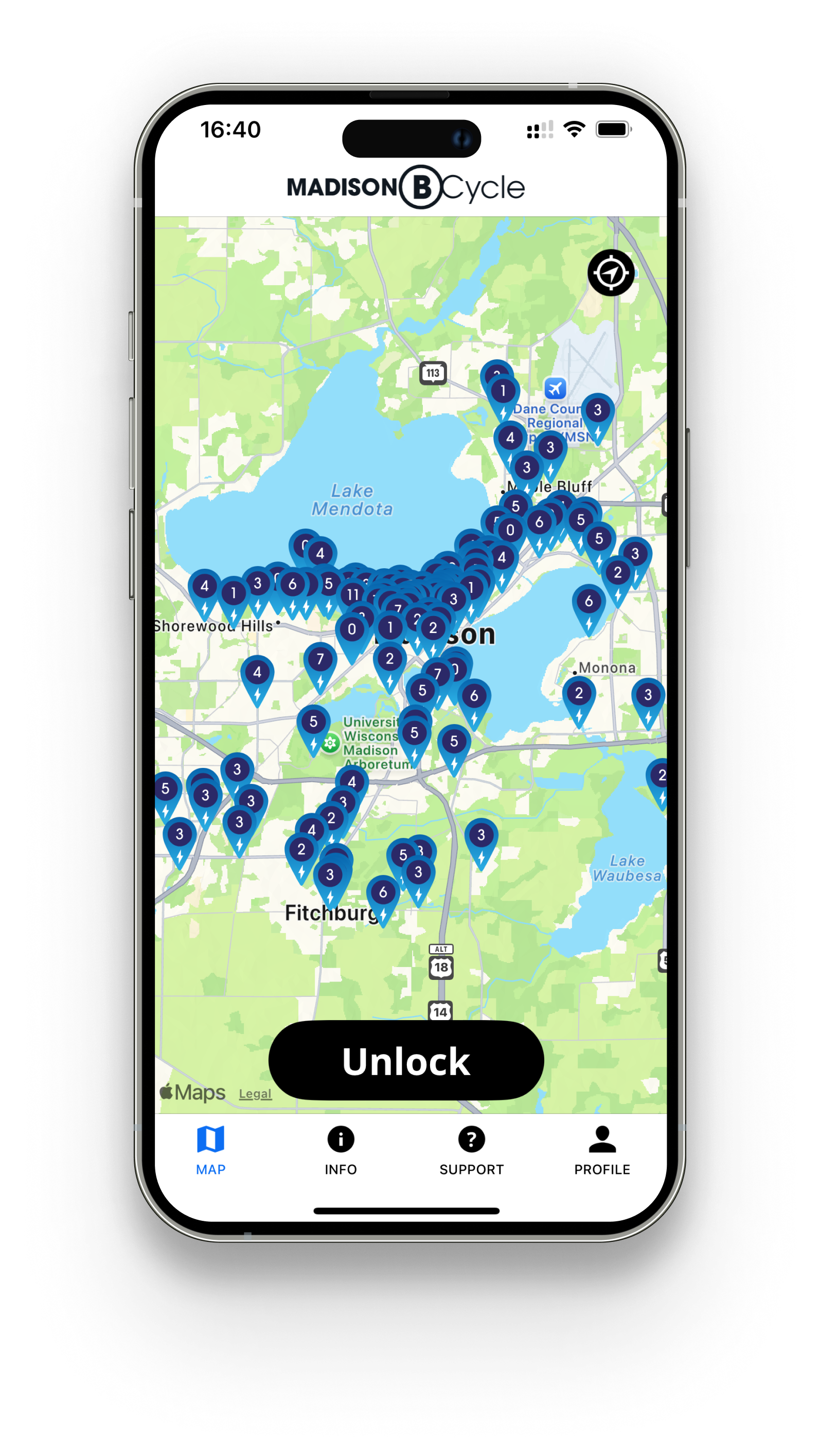
Map Screen
The map screen is the general landing page within the app. From the map page, users plan their trips, take note of nearby stations, and see available bikes.
Before (left): the map screen provided users with the option to check out a bike, but all other information was effectively hidden without more clicking around. Station pins also did not provide available bike data when zoomed too far out of the map.
After (right): the map screen became a one-stop shop to see all relevant information with minimal clicks. Easy access to the Info and Support menus made getting help easy. The Profile icon indicates if the user is logged in or not, with the title “Sign In” if the user is not yet logged in. The Unlock button indicates if the user has an active pass, otherwise the button reads “Get a Pass” to avoid confusion. Users can simply click to see all pass options and purchase a pass before unlocking a bike.
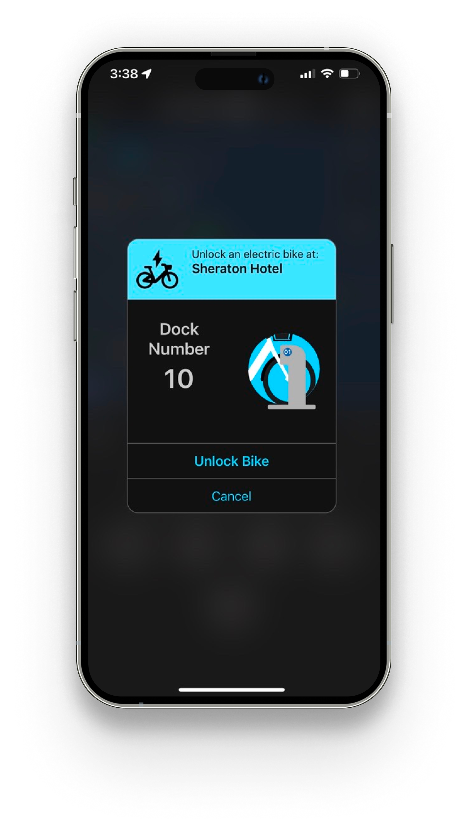
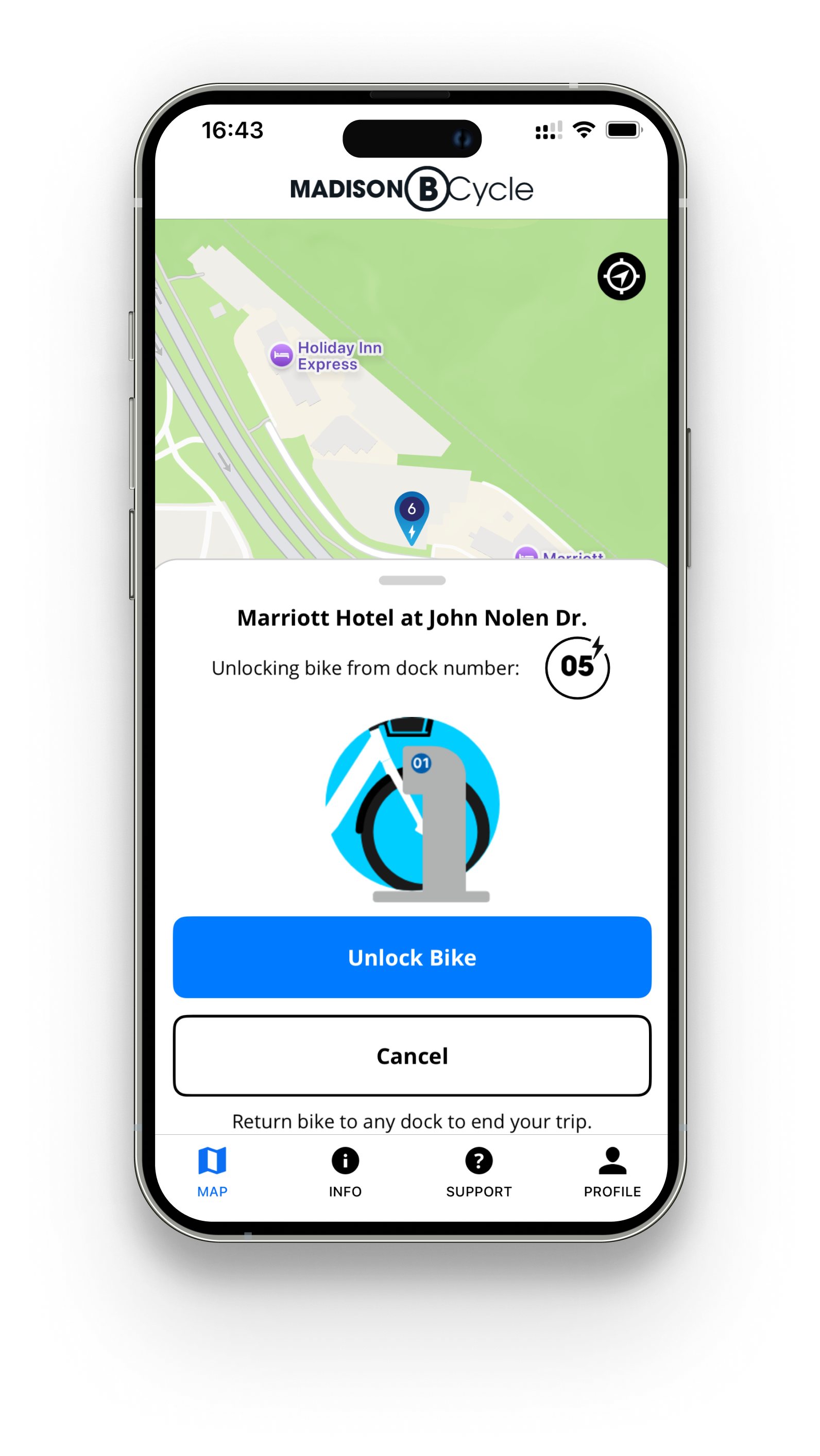
Bike Checkout Modal
The bike checkout modal is the last step of the bike checkout process, and the last screen the user sees before they in theory would put their phone away and start cycling.
Before (left): the bike checkout modal blacked out the rest of the screen, preventing the user from seeing their whereabouts. With little additional information, some users were confused with what to do once they had already checked out a bike.
After (right): the bike checkout modal became a drawer, allowing the user to orient themselves with their current surroundings. A note about returning the bike to a dock reduced confusion among first-time users, making for a more seamless user experience.